Carl Dalio (Color Power and Sketching in Perspective) lives in Sedona, Arizona and is known for his bold, saturated color paintings in oil, watercolor and pastel. He is a signature member of the American Watercolor Society, National Watercolor Society, and Rocky Mountain National Watermedia Society. With a degree in architecture, he has sustained an interest in art and architecture through his work as a successful fine artist and free-lance illustrator. He has served as juror for exhibitions across the U.S., including invited juror for the American Watercolor Society in NYC and elected juror for the National Watercolor Society in California.
You paint across several media. What does watercolor give you as a medium?
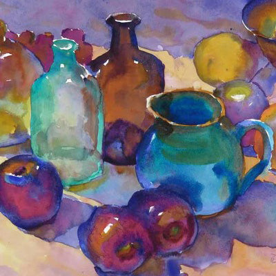
I love painting in oil, pastel, acrylic and watercolor. However, as a medium choice, watercolor offers some exciting and unique qualities. Beyond its simple requirement of pigment and water as well as portability and easy cleanup, it presents adventures in fluid movement, luminosity and the stunning power of transparency by using the white of the paper. From highlights to shadows, brushing watercolor on white paper can produce rich, color washes that are alive with light. One of the most intriguing mediums to take on, it forever challenges, as well as, surprises me as I navigate matters of application and control. Thank heavens, there is always the chance of fascinating mixes and happy accidents. And based on what I desire to express in the work, I can choose to employ washes using dry brush, thin layers or wet into wet applications.
Some of the most impressive watercolors that first inspired me to explore this medium were those by John Singer Sargent, Winslow Homer, Edward Hopper, Andrew Wyeth and Charles Reid, to name a few. It was always that amazing sense of luminosity, directness, freedom and richness of color that was on full display in their paintings. Working in watercolor, I always feel in touch with the energy and pleasure these artists must have experienced often as they produced their work.
Could you walk us through your process
I look for a subject concept that lights up my creative mind. Do I perceive a story or can I imagine a story that I can heartily express in the painting? A challenging subject concept mixed with a compelling visual story can be the powerful, inspirational fuel that propels me forward with each brushstroke. Do I connect to the subject? Do I have a passion for the subject? And yes, passion and connection to subject might only be minimal, but I can more than likely achieve connection through processes as simple as: enjoying pencil drawing, observing how light creates amazing patterns and exploring the plethora of color possibilities. It’s paying attention to the needs of the painting.
Beginning in my studio from my own photos or painting in plein air, I start with a pencil drawing on watercolor paper. This freehand drawing is casual and expressive without getting too precious. I tape off the painting area and usually prefer to work on cold press paper, 1/2 sheet unstretched or full sheet stretched. With a freshly loaded palette, I begin mixing enough color and water on the palette to cover large, lighter value areas first. I might then initiate medium to dark values next. And, since I don’t use
white pigment, I leave the white of the paper for highlights or necessary, translucent colors. Wet into wet or hard edged passages can be employed in accordance with the emotional tone I desire at the time. I prefer to complete the painting in one session so that I can ride the inspiration wave as long as possible.
What problems do you solve before you begin painting and what problems do you allow yourself to solve while painting? Why?
While enjoying the connection and story building process, I focus on structural concepts. I’m thinking about and planning the composition. It’s basic puzzle building. How can I take a subject’s parts and build a dynamic, graphic puzzle? Before paint touches paper, I’m considering shapes and values, analyzing light, studying shades and shadows and imagining some major color areas. I advise students to make thumbnail sketches. But after many years as a freelance illustrator for international architecture firms, I must admit, a thumbnail preplan takes place mostly in my head.
The painting gradually takes on its own personality. I let the painting speak to me while I proceed with my drawing and brushwork. I love walking on the edge of uncertainty, so I resist the urge to tightly plan each step. I like the feedback from every brushstroke I put on the surface. Of course, I can always edit, evolve and distort shapes. I can invent new and bold color ideas. I can paint with loose, expressive brushstrokes. Perfectionism is not the name of the game here. My goal is to discover the life within the subject and to convey, with genuine passion, that awesome life to the viewer.
Pigments: Do you use transparent, semi transparent or opaque paints? Why?
When it comes to water media, I’ve always considered ‘transparent’ watercolor to be the best vehicle for what I want to relate and express in my work. It goes back to engaging the white of the paper. To me, varying thicknesses of transparent washes take on a wondrous glow from the white surface, acting like breathtaking, backlit, stained glass. It’s as if the color forms are connected to an electric circuit. The whole mechanism is alive and charged with radiant light.
Of course, some of my tube pigments have more opaque qualities. These are particularly great for areas where granulation is especially exciting. When mixed together with highly transparent colors, they add a familiar thickness that lets me push pigment around on paper while achieving alluring texture.
How do you plan the colors in a piece?
Every subject and every painting presents a new opportunity for color responses. Generally, I look for and utilize local color. That said, the rebel in me soon tries to change the status quo. For example, instead of the supposed, ho-hum of existing color, I may choose an initial, surprise color in one area to shake up my own ship. I’ll use that color as a stepping stone to make a color choice for the next part of the painting. It’s like crossing a small stream. Instead of preplanning every step in my progress, I place one stone out in front, step on that one, and look around, and hopefully discover where to place the next one. Feedback, intuition and experience reign.
I pay close attention to color temperature. Everywhere I look I see amazing warm and cool fluctuations in color. Variations are due to the influence of light and reflections from the surrounding environment. Warms and cools can appear somewhat subtle or strikingly intense. This color phenomenon is recorded in our subconscious. I want to consciously communicate these magnificent shifts of temperature in my paintings. To achieve this, I often focus on complimentary colors. What adjacent or surrounding color will enhance or subdue the color I choose? How can I fire up or cool down one color by using a neighboring color?
What’s the biggest challenge you see with students and color?
I see color as a multi pronged challenge for some students who come to my workshops. Careful observation regarding the effects of light, abundant experience with color mixing, basic understanding of the color wheel, knowledge about possible color schemes and trusting in one’s on-board intuition are some answers to the challenge. For most of us, it takes hours behind the brush to gain the confidence to choose pleasing color. Success and failure will occur and is the only route to new illuminations about color combinations. Take note of stimulating color schemes in the world around us. Analyze how other artists have used color to their advantage. Make memory notes about workable color mixes and combinations and file them in your mental toolkit for future use.
I like to think out of the box when it comes to color choices. How far can I push my color combinations and stay within the parameters of my visual concept? Am I choosing color that lifts, delights and surprises? Am I creating color mixes that enhance and bring life to my painting?
What do you need from a reference photo? What don’t you need? Why?
I work from my own photo references. I’m always on the lookout for stimulating material that calls for a painting session. I need material that suggests a story, embodies emotion, and offers the possibility of evolving in a new direction. Since subject photos can display tons of detail, I search for the underlying, abstract attributes of a subject. This is the substructure that will ultimately give authority to the painting. I use my camera to initially crop the subject to achieve a possible composition. Is the subject of my painting too small in the format? Can I crop it tighter so that larger and bolder shapes occur?
Composition is one of my major components and I can run with a photograph that has very little detail. My job is to edit and simplify so some parts of the reference will be altered or deleted. When needed, I can add or imply my own detail where required. I sometimes find myself working from black and white sketches or photos that force me to be more imaginative in my color choices. Often, I will crop deep within a photo to obtain a more dynamic arrangement of shapes.
Do you ever feel yourself getting tied to the reference photo? How do you keep yourself from copying the reference photo?
It’s easy to slip into the lure of a photo. Mindless copying can easily occur. My directive is to never let that happen. Why be a slave to mimicking a photo when technology puts amazing photo gadgets within our reach? If I even approach the territory of ‘copying’, the little guy behind the little desk in my mind sets off the copy alarm. This sad, copy condition results from prolonged fatigue and the need for a deserved break.
To avoid the magnetic ties to photo references, I employ simple strategies. I focus on the composition. I squint my eyes to see the big shapes. I’ll use a mirror to understand balance and to stay on track with my overriding statement. I use a larger brush. I paint faster and looser. I paint as if I’m about to catch that departing train and it’s up to me to promptly put down the essential elements that tell the story.
What are the design elements or principles you find yourself drawn to most in your work? Why those?
As I’ve stated, composition is so very important. I pay attention to the puzzle and therefore carefully arrange and manipulate the shapes that form the puzzle. Do I have a pleasing variety of sizes and shapes? I visually weigh the size of elements and
determine their placement to balance the composition. I often think of shape arrangement in geographical terms: islands, peninsulas and continents. I need them all in appropriate numbers and positions.
Division of space is another important factor. I design places for colors and shapes by measuring distances of objects both horizontally and vertically. If I’m doing a landscape, for instance, is my horizon line cutting directly through the horizontal center of the format? As a simple example, I might place the horizon off center for emphasis and interest: two thirds sky, one third land emphasizing sky or two thirds land and one third sky emphasizing land. Various objects might march across the composition displaying a variety of measurements between them instead of the same, boring distance between each object. In this way, I arrange shapes that perform like mesmerizing, musical notes in a compelling melody.
How important is drawing? What does being able to draw give you as an artist?
In terms of recording the nature of my subject, drawing is so essential. Through initial pencil lines, I explore the placement and size of shapes. I set the tone for the personality of my visual story. Is it precise, realistic and formal or loose, impressionistic and informal? Am I truthfully describing the subject at hand? Do I need to change or morph the shapes to fit my intended statement? The drawing provides the basic guide (the cake structure) for color washes (the icing) that will soon follow.
Every opportunity to draw improves my hand and eye coordination, preparing me for the next drawing/painting event. In addition to shape and structure factors, drawing provides much needed quiet and observation time. As a meditative exercise, it allows me time to settle down and focus on my creative center. This will set the stage for a calm and enjoyable painting experience. As an observation time, it allows for a deeper understanding of structural elements and supports my efforts to describe unique characteristics of the subject.